Weekly Design Inspiration: Warm Up Inside
Now that we’ve broken in the new year, let’s take a look at one of the new trends that we are obsessed with! While we love greys, blues, and other cool hues, it is time for their warmer cousins to come back into the spotlight. As with all trends, the pendulum has begun to swing back again and we are loving what we are seeing! This week we will show you how you can begin to incorporate some of these shades into your home, even if you’re not ready to fully commit yet!
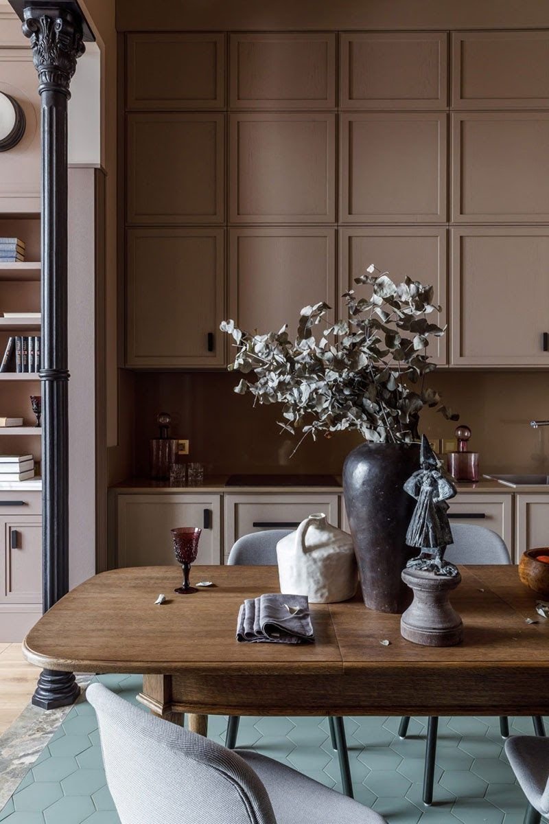
Brown-Nosing
We know, we know--didn’t we just paint over the creamy beiges of the 90s? Yes we did. But this trend takes on a deeper meaning, think more milk chocolate and hazelnut and less latte. If you’re looking to redesign your kitchen, consider using a creamy hue as opposed to navy. It’s bold, but not bold enough to tire of it. If you’re looking for a smaller splurge, consider buying or reupholstering your chairs in a velvety, chocolate brown. The shade might be reminiscent of the 70s but the silhouette of the chair will be fresh.
Source: SampleBoard
Source: Fredericia
Truth & Terracotta
Terracotta is a wonderful blend between masculine and feminine. The older sister of Millennial Pink, terracotta is a pink that works beautifully as a neutral. Plus, it is an incredibly diverse shade that can be styled to suit many tastes. You can pair it with a worldly, eccentric look to keep it fun, or use vintage pieces to make it feel more adult. Paint a wall if you just want to dip your toe in or buy it in various shades for maximum impact.
Source: Pufik Homes
Source: Maison Travaux
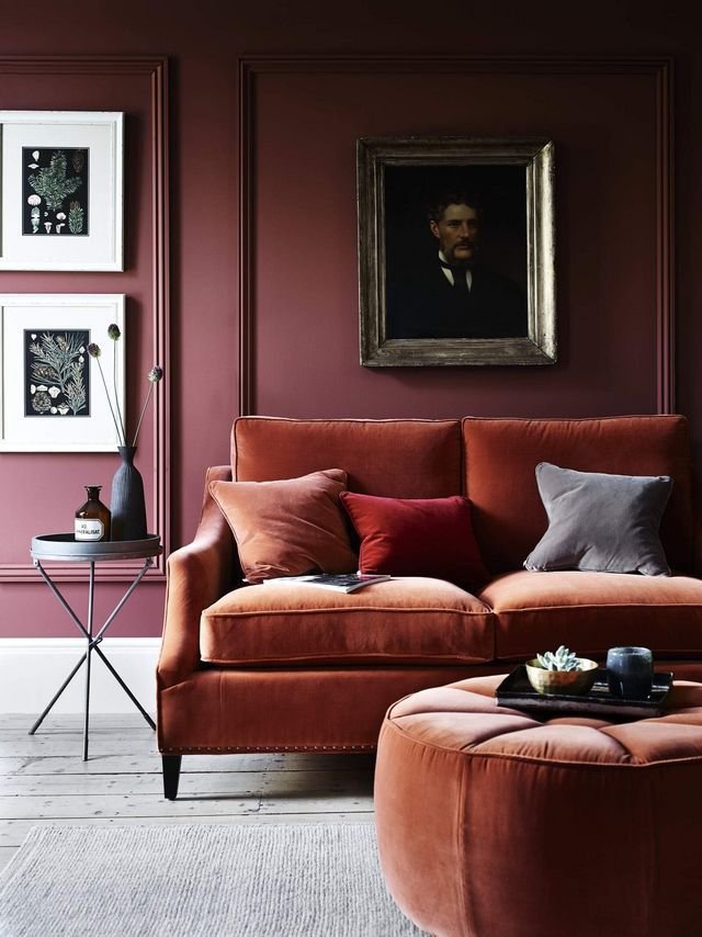
Would You Like Some Wine?
Red, red wine--not only one of our favourite treats, but also a super on trend look! Think Adele’s stunning “Easy on Me” leather trench coat. We love this colour because it grounds a space without having to revert to black, brown, or grey. It’s not only stunning but also practical, as the deeper hue hides a multitude of sins. A couch is a great option for those of us looking for a statement piece, while a beautiful matte paint is a great backup for those of us who aren’t ready to take the plunge quite yet.
Source: Frenchy Fancy
Source: Soho House
Design Tip: With these colours, more is more! The warmth in these hues is complemented when you add other warm colours to it. Think of rusts, mustards, and ivories if you need a jumping off point!


