Weekly Design Inspiration: Elevated Details
Every once in a while you walk into a space that instantly makes you feel like you’re standing in history. As designers, we strive to create spaces that make people feel this special and we wanted to share some of our favourite tricks and tips with you in order to achieve that elevated look. There are so many ways to infuse that old money elegance into your home but we picked a few things that are more doable for a DIY project, like casing, grilles, and layouts.
a little trim
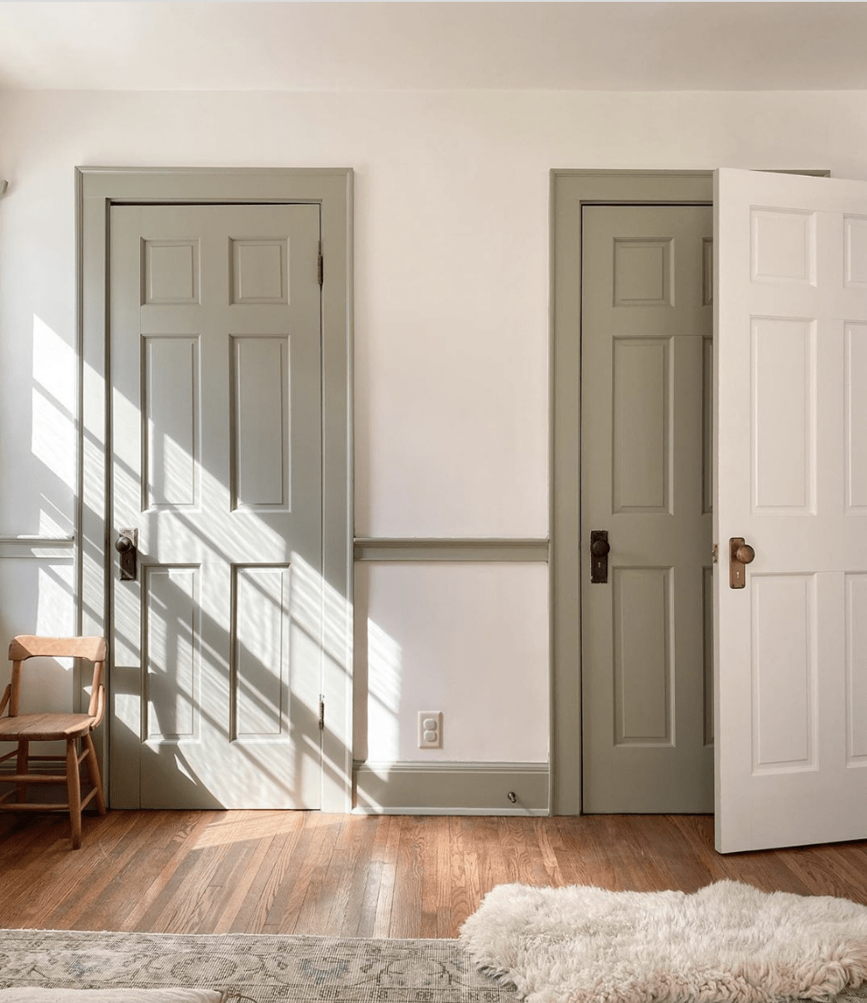
Chances are if you have a home built or renovated in the 80s or after, you might have been saddled with the builder basic colonial casing. This casing is usually about 3 ¼” wide and often doesn’t correlate to the scale of the space. Additionally, since it’s so common in modern homes it isn’t associated with custom spaces and it doesn’t help to add character to your space. Instead, go for a something wider; 4 ½” casing is a good starting point, and older homes should look at something closer to the 6” mark. Country homes work with something that has a flatter, Arts & Crafts style casing, while Victorian and estate-style homes work well with a Colonial casing.
Source: Megan Stokes
Source: Bri Heiligenthal
just venting
Another space in the home that is often overlooked are the vents and grilles in the home. Historic homes used to have beautiful iron grilles and vents throughout the home that were works of art unto themselves. Now homes are often stuck with metal grates that don’t speak to any particular aesthetic. If you’re looking for a project that involves minimal labour then try swapping out the vent covers for something with a bit more flair!
Source: Laurel Home
Source: Francois et Moi
Seeing double
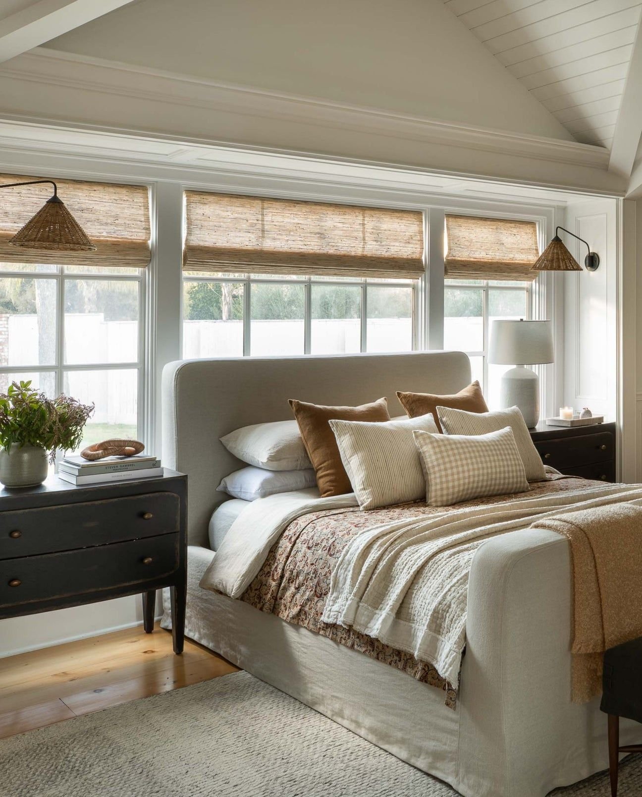
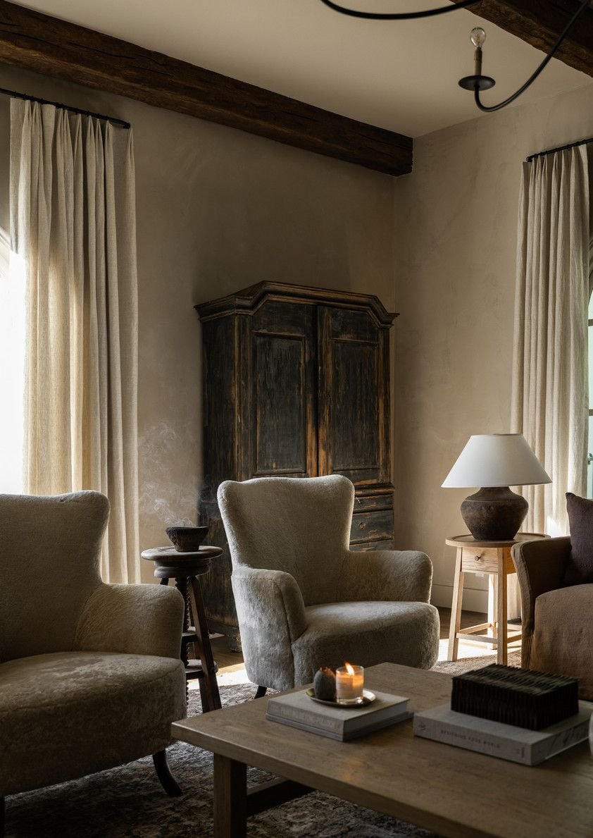
If you’re looking to work with what you have for now then try to think about how you can rearrange your items in order to achieve the vibe for less. Old money is often associated with traditional design, and one of the staples of traditional design is a symmetrical layout. Sets of lamps and side tables instantly make a space feel like it’s put together. Additionally, look for items that may have an exaggerated silhouette in order to highlight the symmetry of a space, such as a four-poster bed frame.
Source: Amber Interiors
Source: Amber Interiors
Design Tip: Another way to communicate an elevated sense of style is to go with a monochromatic palette. It gives the impression that the space was carefully designed with custom items!


