Weekly Design Inspiration: Colour Combos!
After all of the time that we have spent at home, many of us have grown tired of looking at the same four walls. Maybe some of us have even grown tired of recent changes we’ve made. As we head into winter, let’s look at what colour combinations are making a splash! These daring duos can be done on a budget and easily switched out in a few years.
Perfectly Peach
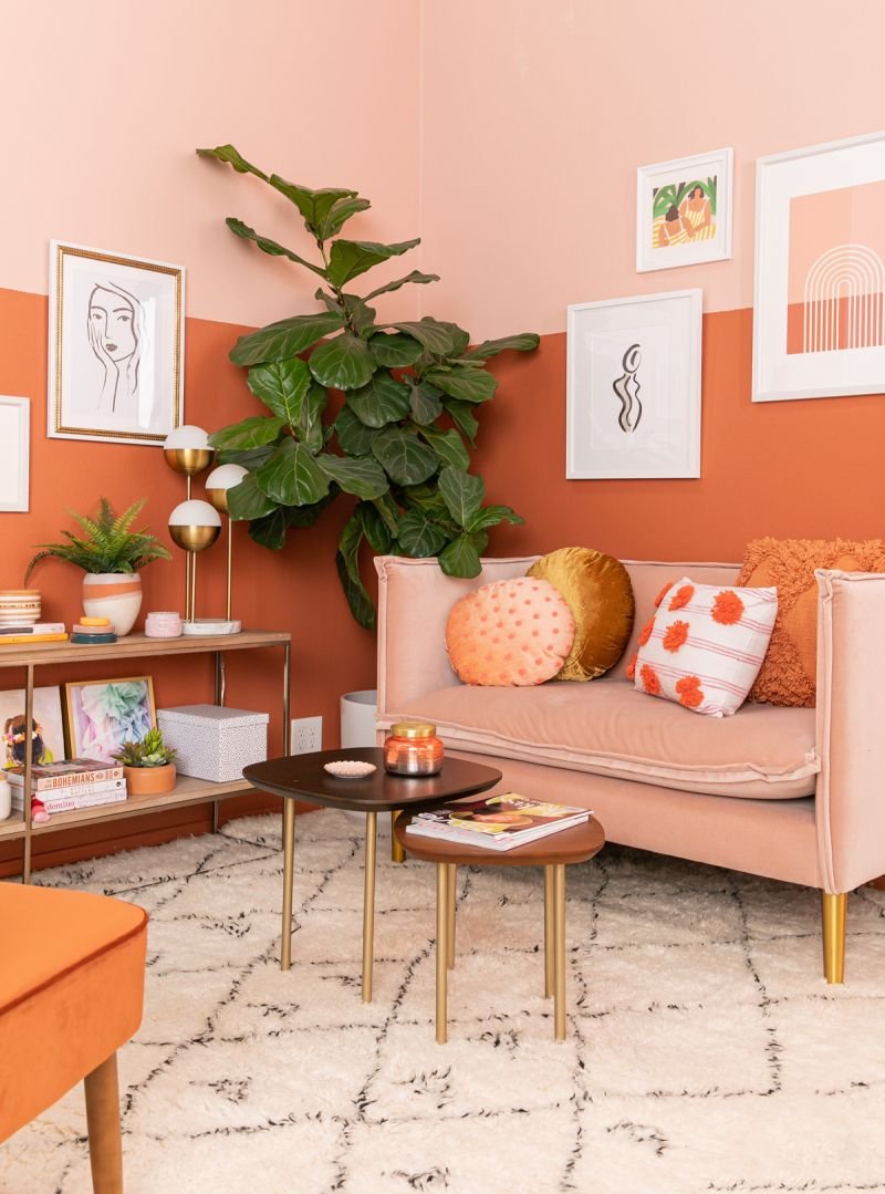
The 70s have come back and in a big way. Flare jeans, big hair, and even music have all taken their cues from the groovy era recently. If you want a boho take on a throwback colour, consider introducing peach into your home. To complete the look, pair with a tonal complement or go with a mustard yellow. This colour instantly brightens your mood and looks fabulous with any species of wood! We love Benjamin Moore’s Peaches ’n Cream (#040) and Rosy Peach (#2089-20).
Source: Oh Joy!
Source: Apartment Therapy
Down to Earth
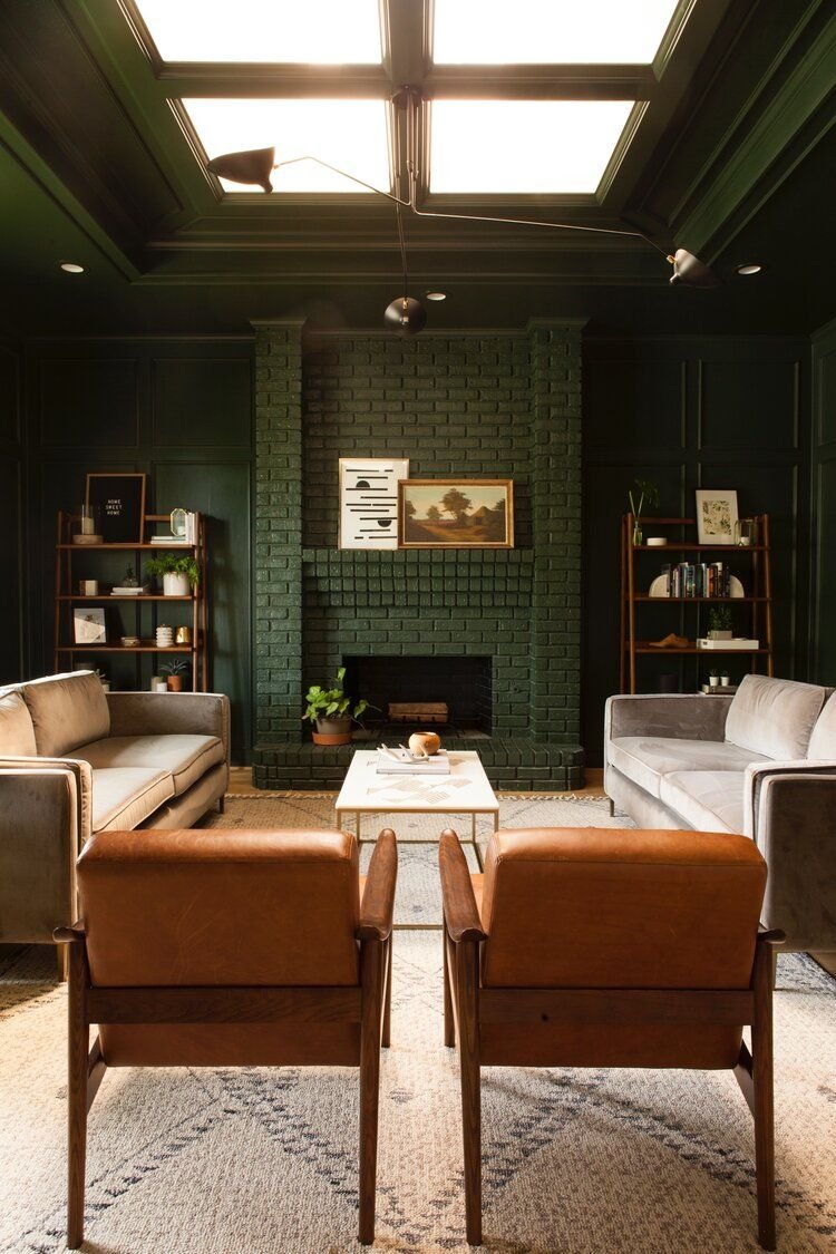
If you’re looking to ground your home, look no further than a moody, greyed-out green paired with a true walnut. The look creates nothing less than a forested wonderland. The dramatic green is regal, timeless, and comforting, while the wood feels laid-back and adds a heritage vibe. We totally recommend Benjamin Moore’s Salamander (#2050-10) and Tarrytown Green (#HC-134)!
Source: Style by Emily Henderson
Source: Sarah Fultz Interiors
Big Blue World
Sometimes, you just want to be swept up in a big sea of blue, wrapped in deep tonal hues. That’s why we adore the calming properties of blue. Especially with such a chaotic couple of years, we might just need a dose of relaxation. Or, go with a vibrant pop of electric blue if you aren’t afraid of some fun! Our current favs are Charlotte Slate (#AC-24) by Benjamin Moore and Farrow & Ball Down Pipe (#26).
Source: Timber Trail Homes
Source: Emily May Designs
Design Tip: Happiness doesn’t happen according to trends. Although neutrals have been mainstream for a while, there’s no right or wrong when it comes to what makes you happy. If you know that you would love coming home to a yellow velvet couch, we say, “How soon can you get it?”


