Lay it Out
Once you’ve chosen the tub, the toilet, and the sink, you may feel like there’s little space left to show off your style. This is where smaller details like tile layout can come into play. Tile layouts can communicate a time period, a culture, as well as your personality. Although many of us know and appreciate classic patterns like brick, herringbone, and chevron, there may be some more niche options that better suit your space.
Nitty Gritty
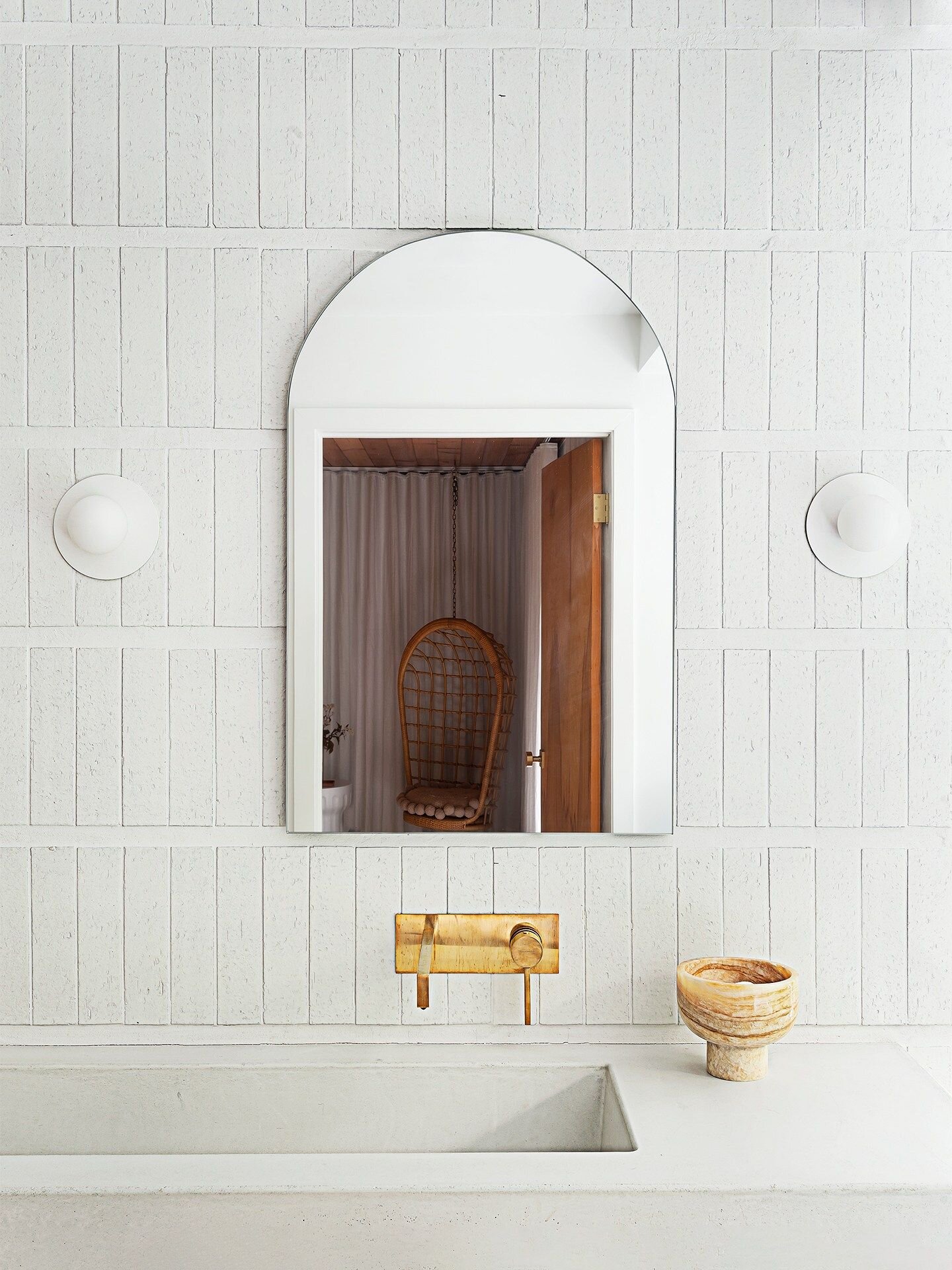
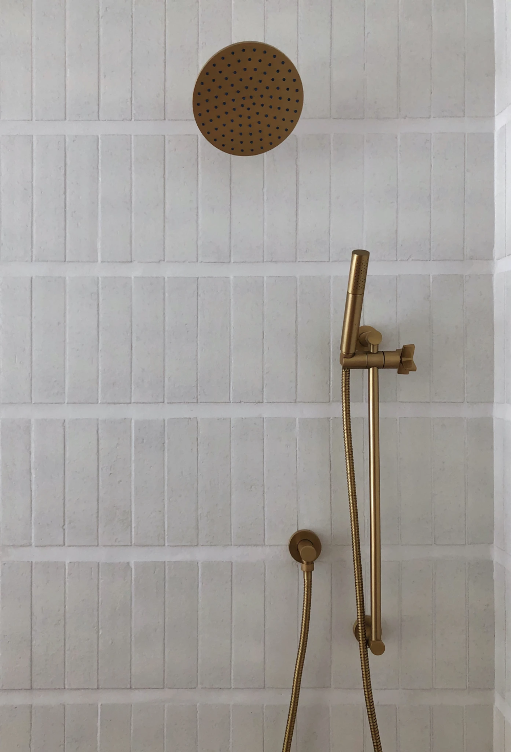
This first tip has less to do with the tile and more to do with the grout lines. Although we have recently been seeing smaller and smaller grout lines, variance in the grout width can create a look completely unique to you. Lay out some of the tiles on the floor and play with the distances, whether that be one thicker horizontal line, or a repeating pattern. The overall effect will look very contemporary and can help to showcase any special tiles chosen.
Source: Domino
Source: Cle Tile
Something’s a Little Off
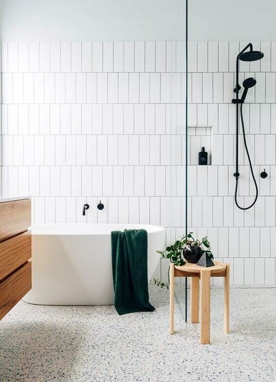
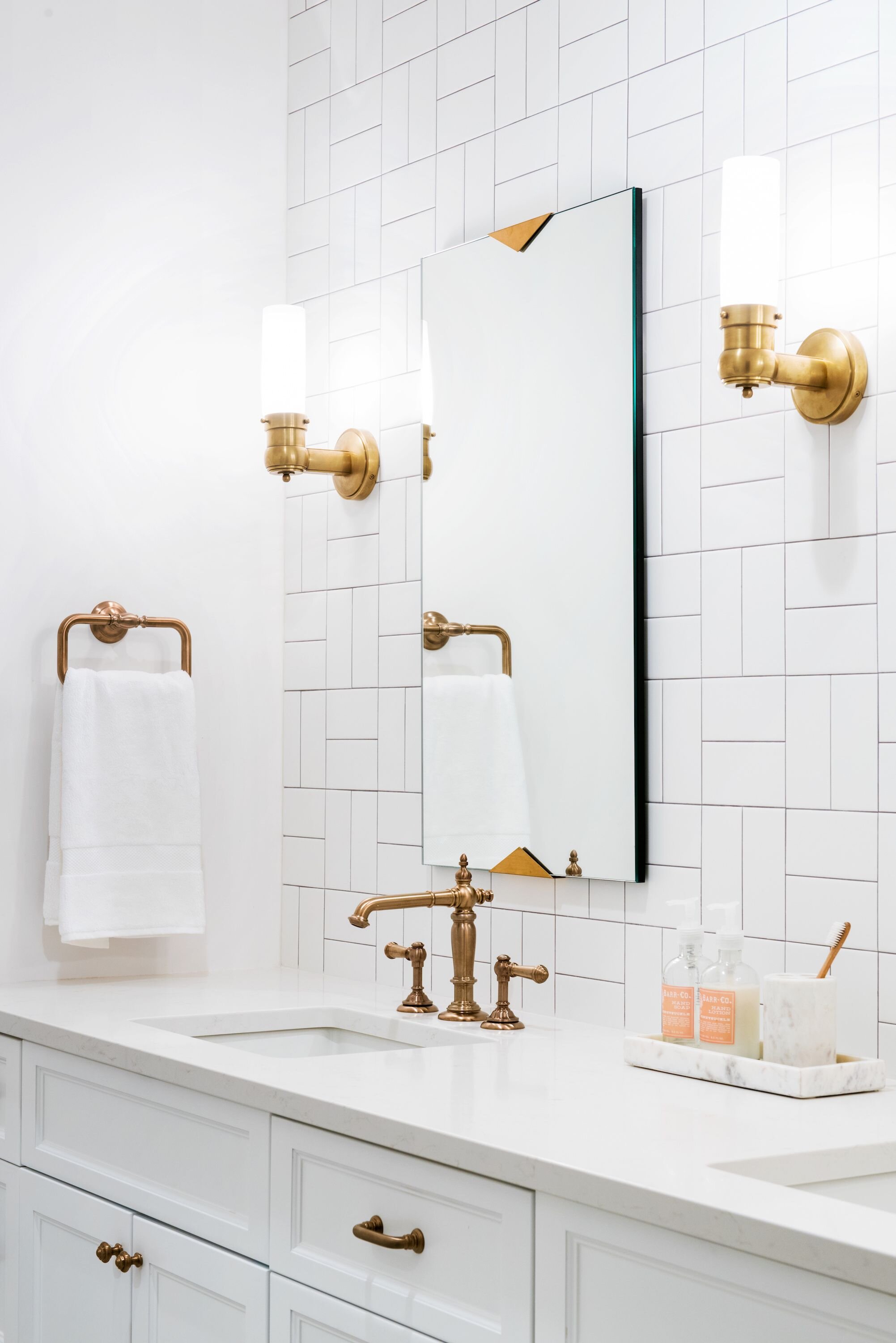
Stacked vertical tiles have become very popular over the past couple of years, and the look lends itself to modern homes with sleek lines. However, not all of us have homes that would match the trendy layout, so we might reach for something that looks a bit softer. By creating an vertical offset tile layout, you are getting the best of both worlds. You achieve the effortless look of the vertical tile, while also incorporating the heritage touch of offsetting the tiles.
Source: Construction 2 Style
Source: V2Com Newswire
New Basket
Basketweave tile has been around forever, constantly reinventing itself and working its way into new homes and old homes alike. The latest reincarnation of the basketweave layout plays with scale. Larger rectilinear tiles can stack up 4 or 5 tiles high before switching direction. However, don’t be afraid to think small, either. Smaller tiles can create a more intimate, mosaic-like look, perfect for boho homes.
Source: Caitlin Wilson
Source: Sophie Allegra
Design Tip: If you’re renovating on a budget, try to stick to tile layouts that involve the least amount of cutting. Labour prices go up with patterns like chevron due to the amount of time required to measure and cut. Simpler layouts like vertical stacking will be easier on your wallet.


